NUS Business School — website
Redesigning IA & UI
Project 2
Assigned as a part of the UX course project from General Assembly Singapore
Case Study Outlines
• Heuristic Evaluation
• Competitive Analysis
• Cognitive Walkthrough & User Feedbacks
• Content Audit & Site Mapping
• Card Sorting
• Building new IA
• Tree Testing
• Final IA
• Usability Testing & Iterations
• Final Prototype
Team Members
Cory Meilany
Ethan Lim
Marge Wee
Duration
2 weeksPersona

Mark is a prospective student and starting the college application process. He thinks he might be interested in majoring in ........ but he also loves ........ Mark still isn’t sure whether he wants to live on campus and needs all the financial aid and scholarship opportunities he can find.
Needs:
• Admission requirements
• Scholarship opportunities
• Student body make-up, teacher ratio
• College programs and specialties
• Campus housing info
Pain Points:
• Learning about a new city/neighbourhood
• Picking a major
• Scheduling
• Learning about extra curricular activities
Problem Statement
Mark needs an efficient way to compare different courses because there is too much cluttered information which is also deep in the site.
Hypothesis
We believe that by making the site easy to navigate, it will help him to be more efficient in finding his needed information for enrolment. We know this to be true when the path and time taken is lesser than his initial usage test of the original website.
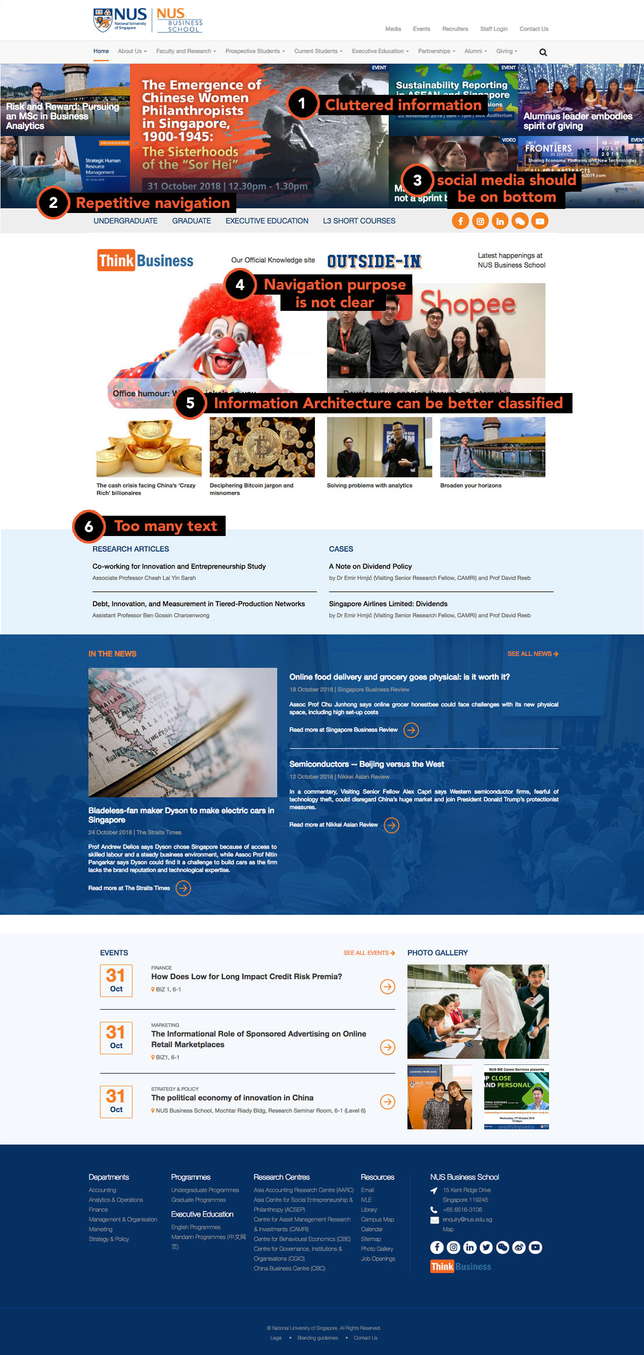
Heuristic Evaluation
https://bschool.nus.edu.sg
Being assigned project partners and NUS Business School website, we are to redesign the Information Architecture (IA) and the key pages of the current website according to our persona’ needs. We first started by doing heuristic evaluation and found a lot of problems like:
- Some repeated links
-
Cluttered info
-
Obtrusive visuals for news/banner
-
Design elements not consistent across site
- Some info is hidden, not easy to search
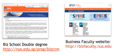
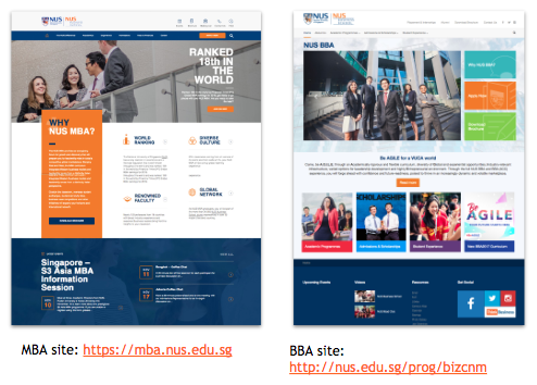
When we did demo for some tasks as prospective students, we found out that it has many microsite and external links to get crucial information. See below samples:
Competitor Analysis
After analysed NUS Business School website, we visited some of its competitor which are Nanyang Business School (NTU) and Lee Kong Chian School of Business (SMU) for comparison.
NTU Business School
http://www.nbs.ntu.edu.sg
SMU Business School
https://business.smu.edu.sg
NTU has a clean & simple UI design, their navigation terms also easy to understand.
SMU has a professional & modern looks. And it gave a sense of credibility. Each section' placement is purposeful.
![]()
Cognitive Walkthrough
We conducted cognitive walkthrough to find out about:
Firstly we gave users some tasks to accomplish. Some users really lost in the journey finding related info because the path taken are too deep or the info was difficult to locate.
We recorded the user flow and timing for each task completed. We identified some problems by gathering feedbacks from the user about their experiences.
User Feedbacks
SMU has a professional & modern looks. And it gave a sense of credibility. Each section' placement is purposeful.

Cognitive Walkthrough
We conducted cognitive walkthrough to find out about:
- User journey
- User feedbacks
Firstly we gave users some tasks to accomplish. Some users really lost in the journey finding related info because the path taken are too deep or the info was difficult to locate.
We recorded the user flow and timing for each task completed. We identified some problems by gathering feedbacks from the user about their experiences.
User Feedbacks


Content Audit
In getting full details of website page links and reconfirm our findings, we did a content audit on NUS Business School website. To my surprise they are 66 links to external sites, 21 unique external domain, 33 duplicated links and 4 broken links!
Qualitative Discoveries:
• Long routes taken to get wanted info
• Inconsistency of design across domains
• Not clear where to get information
To view more details:
https://docs.google.com/spreadsheets/d/13K_anEw-ySz7q8W0Jk4olYZhV3NY9EV0H9nCtRk7UYY/edit#gid=0
Site Mapping
To visualise hierarchical content from Content Audit, we map out NUS Business School website with Gloomaps.com. By doing this we have a clearer picture which areas is problematic.
Here are some of the findings:
Card Sorting
To gather user insights on how users organising information, we conducted card sorting. At first, we are not sure where to start and what types of card sorting to use. But after hearing feedbacks that sometimes users get lost if they have been given open card sort, we decided to go with hybrid.
To set up the categories, I used existing menu naming from current NUS website and balance it out with other terms from our competitor. We rolled out our 1st card sort to 7 participants with 10 pre-existing categories and 48 cards.
The results gave us a general grouping ideas, whereas we still need clarification for some cards. So we narrow down the categories and conducted our 2nd card sorting to clear our doubts. With a total 12 participants we tested 18 cards and 7 categories. We realised the bigger the participants, the better we see a strong agreement.
Final Card Sort categorisation result:
In getting full details of website page links and reconfirm our findings, we did a content audit on NUS Business School website. To my surprise they are 66 links to external sites, 21 unique external domain, 33 duplicated links and 4 broken links!
Qualitative Discoveries:
• Long routes taken to get wanted info
• Inconsistency of design across domains
• Not clear where to get information
To view more details:
https://docs.google.com/spreadsheets/d/13K_anEw-ySz7q8W0Jk4olYZhV3NY9EV0H9nCtRk7UYY/edit#gid=0
Site Mapping
To visualise hierarchical content from Content Audit, we map out NUS Business School website with Gloomaps.com. By doing this we have a clearer picture which areas is problematic.
Here are some of the findings:
- There are lots of duplicated pages in L3 Short Course
-
For Undergraduates, Graduates, and Executive MBA, some info are located in the external domain
- Found some broken links
Card Sorting
To gather user insights on how users organising information, we conducted card sorting. At first, we are not sure where to start and what types of card sorting to use. But after hearing feedbacks that sometimes users get lost if they have been given open card sort, we decided to go with hybrid.
To set up the categories, I used existing menu naming from current NUS website and balance it out with other terms from our competitor. We rolled out our 1st card sort to 7 participants with 10 pre-existing categories and 48 cards.
The results gave us a general grouping ideas, whereas we still need clarification for some cards. So we narrow down the categories and conducted our 2nd card sorting to clear our doubts. With a total 12 participants we tested 18 cards and 7 categories. We realised the bigger the participants, the better we see a strong agreement.
Final Card Sort categorisation result:

Building draft IA
After finalising the card sort we started drafting a new sitemap and we’re ready to evaluate the findability of our information through tree testing. We crafted 4 scenario tasks based on Mark’s needs and pain points. We decided to focus on these 4 areas:
• Admission requirements
• Scholarship opportunities
• Campus housing
• Comparing two majors
Tree Testing
The average time for each participant to accomplish the task is 15 sec and we achieved 83% success rate on overall tasks.
To find Admission Requirements, 60% of user went to Admission & Scholarships as expected. 40% of user journeys went to ‘Undergraduate > Specific programmes’. The reason is because they understood admission requirements as the minimum cut off grade of each programme.
![]()
Final IA
Finally after get the insights from tree testing, we revised our sitemap according to our new findings. We decided to put in admission requirements menu under each programme.
The improvement made with this new IA:
To view final IA: www.gloomaps.com/mgmdGghA7v
After finalising the card sort we started drafting a new sitemap and we’re ready to evaluate the findability of our information through tree testing. We crafted 4 scenario tasks based on Mark’s needs and pain points. We decided to focus on these 4 areas:
• Admission requirements
• Scholarship opportunities
• Campus housing
• Comparing two majors
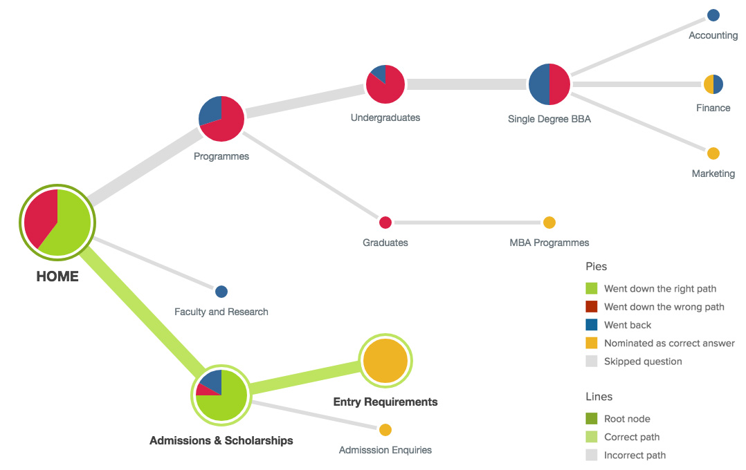
Tree Testing
The average time for each participant to accomplish the task is 15 sec and we achieved 83% success rate on overall tasks.
To find Admission Requirements, 60% of user went to Admission & Scholarships as expected. 40% of user journeys went to ‘Undergraduate > Specific programmes’. The reason is because they understood admission requirements as the minimum cut off grade of each programme.
Final IA
Finally after get the insights from tree testing, we revised our sitemap according to our new findings. We decided to put in admission requirements menu under each programme.
The improvement made with this new IA:
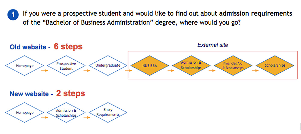
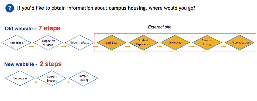
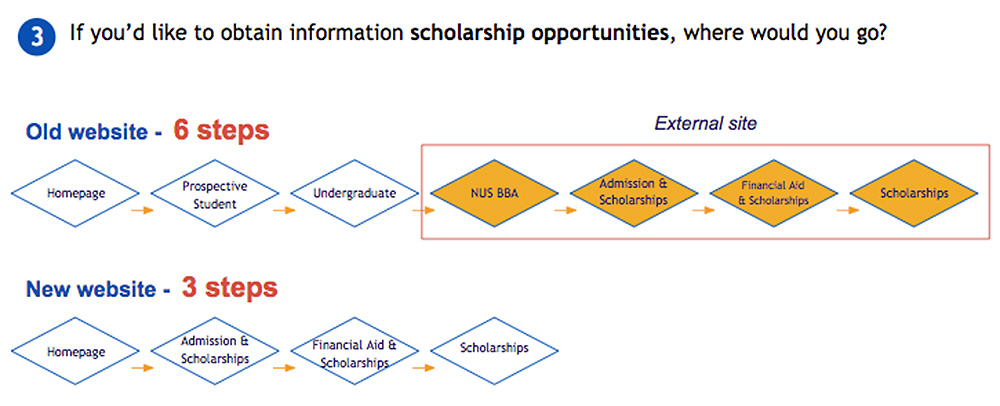
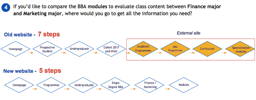
- Reduced Depth (no. of clicks)
- Lesser time to find information
- Direct Journeys (no external sites)
To view final IA: www.gloomaps.com/mgmdGghA7v
Old vs. New User Flow
Usability Testing
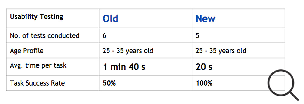
The new prototypes has reduced the depth of the path taken to get specific information. And users also spent less time for each task with 100% success rate. In general, we’re quite happy with these results.
![]() Iterations
Iterations
We got some feedbacks from users on our new prototypes, a user mentioned that our prototype lack of search feature on the top of each page. Because for her it’s essential feature in case they got lost, they can always use that search bar.
Besides this, user also feedback that we should have “Apply Now” on our navigation menu. We thought it was a good feedback because it’s something like call to action.
Majority of the users said the prototype much cleaner and easy to navigate around compared to NUS Business School current website. Some of the iterations we made:
Final Prototype
![]()
https://invis.io/7KP0BGWPTHQ
The new prototypes has reduced the depth of the path taken to get specific information. And users also spent less time for each task with 100% success rate. In general, we’re quite happy with these results.
 Iterations
We got some feedbacks from users on our new prototypes, a user mentioned that our prototype lack of search feature on the top of each page. Because for her it’s essential feature in case they got lost, they can always use that search bar.
Besides this, user also feedback that we should have “Apply Now” on our navigation menu. We thought it was a good feedback because it’s something like call to action.
Majority of the users said the prototype much cleaner and easy to navigate around compared to NUS Business School current website. Some of the iterations we made:
- Add in ‘How to Apply’ under Admission & Scholarship dropdown menu
- Add in a fix ‘Search Bar’ on top right navigation for each page in case they can’t find needed info
Final Prototype

https://invis.io/7KP0BGWPTHQ